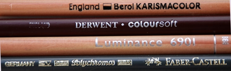
 For an artist, there is always a high level of excitement that comes with unwrapping a package filled with freshly acquired art supplies. However, the opportunity to receive a package containing coloured pencils from a discontinued line dating back to 2005 dwindles with each passing year, making it increasingly unlikely to acquire such coveted items.  Fortunately, auction sites like eBay occasionally list Berol Karismacolor pencils, and I was extremely fortunate to discover a couple of sellers who are currently selling off stock from a craft supply clearance, allowing me to acquire some brand new stock. It was quite a surprise to discover some of the rarer colours in the collection as well. Pencils, both coded and non-coded, plus some discontinued colours can be found through these sellers. Links can be found in the article link at the bottom of this page.  Karismacolor pencils were the European counterpart to the widely favoured Prismacolor Premier pencils. The original Prismacolor pencils debuted in 1938, while Karismacolor emerged in the late 1980s in England. In 1995, ownership of the company transferred and production shifted to the USA. The emergence of new European pencil brands likely contributed to the dwindling sales of Karismacolor pencils, and coupled with elevated shipping costs, led to their discontinuation in 2005.  The Karismacolor pencils were originally offered in 72 colours, with each pencil prominently showcasing the designated colour name on the barrel. Over time, the colour palette expanded, and colour codes were introduced to align with the Prismacolor range. Throughout the production period, a total of 129 colours were created, but due to discontinuations, the largest available set consisted of 108 colours.  Should you wish to acquire some of these pencils, the links that direct to the sellers of the Karismacolor pencils can be found on the webpage link below.
I have written a comprehensive article about these pencils, which can be accessed on my Step by Step Art website by clicking this link. Please be aware that I am not affiliated with these sellers. I am aware of the challenges in finding these pencils, and having had a positive buying experience myself, I wanted to pass on this information to others. I will endeavour to include references to other sellers offering these pencils once their stock has been sold, whenever possible; however, there may be situations where no such links can be found to share. If you have fond memories of the Berol Karismacolor pencils, please leave me a comment below. I would love to hear from you!
0 Comments
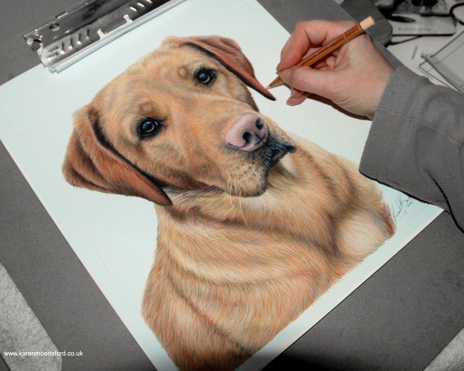
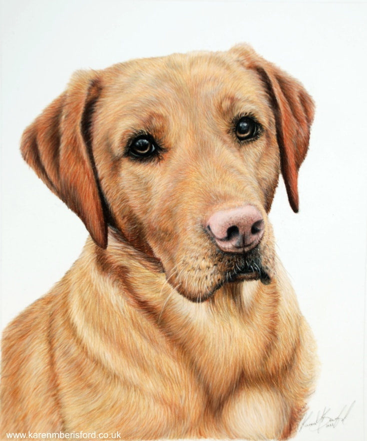
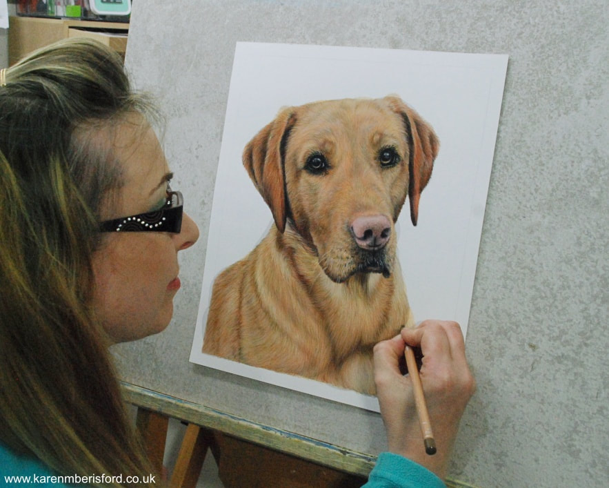
It is always lovely to receive feedback from clients. Every single one of my commissions are created with care and you do get attached to the pet. You know you're unlikely to ever meet them in the flesh, but could pick them out in a crowd, having spent so many hours staring at and creating, their beautiful faces with all their tiny markings and (im)perfections.  A thank you from a happy customer is a celebratory one. The fact that someone takes the time to send an email and to tell me how well the portrait was received, always brings a great sigh of relief knowing that they appreciated the time spent on the portrait. I thought I would share it here. Here is the framed portrait of Dougal, a Red Fox Labrador completed in coloured pencils. What a beautiful dog he is. If you want to see more of my coloured pencil art (including Rua, Dougal's sister), click here. If you are thinking of booking your own bespoke commission, find out more here. A BIG THANK YOU to Karen for her fantastic piece of work to complete |
 | 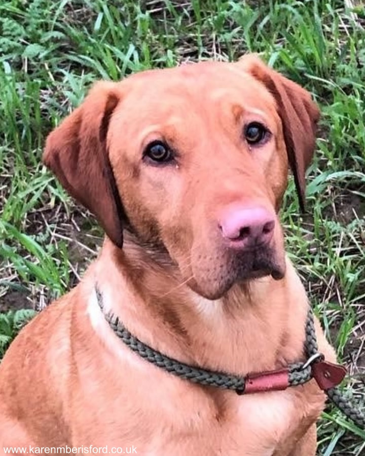 The reference image |
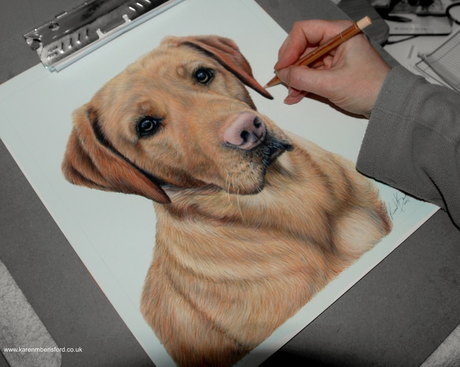
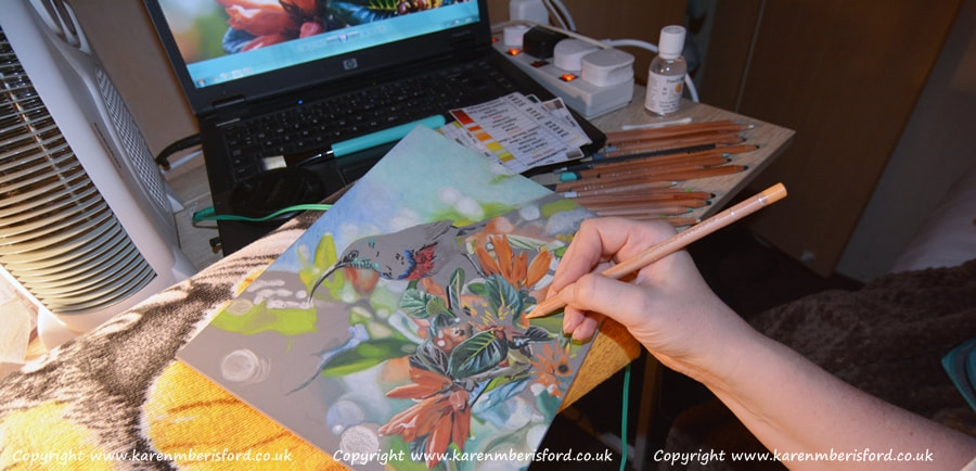
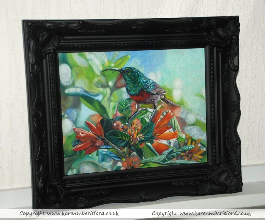
Now that I'm back in my studio, I'm working on the autumn newsletter for my website and have limited time. I plan to store the portrait in a spare frame until I finish it.
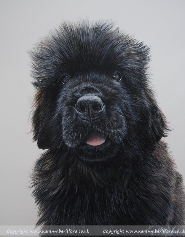 | Jetson - The 9 month old Newfoundland Dog |
George Darling |  |
Wishing you the very best for the New Year 2019!
I've completed all the Christmas commissions and took a well-deserved break to recharge. Now, I'm back in the studio, creating new articles and planning exciting art workshops for 2018 on my Step by Step Art website. There are numerous tasks to accomplish behind the scenes. If you're interested in booking a personalized commission or are an artist searching for helpful articles, mini-tutorials, and a chance to attend a 1-day art workshop with me, click on the links below to visit my website.
Here's hoping 2018 is a wonderful year for you!
Karen
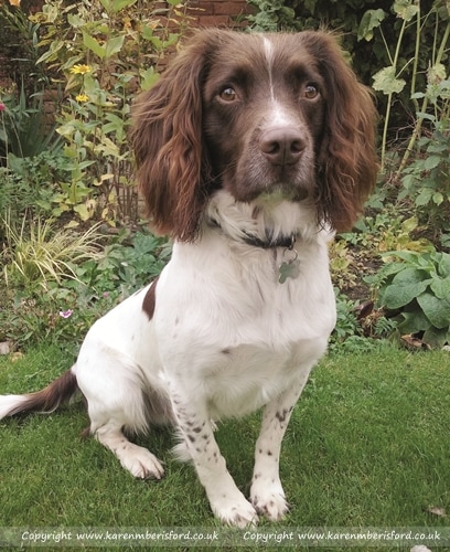 | Buddy the Springer Spaniel - 11" x 14"Buddy's portrait was created using 5 different photographs. The body taken from this photo, the head from another, the tail from a third, the background from a fourth and some of the background flowers from a fifth image, all cut and pasted together to create the mock up of the reference image. Doing this can throw a whole lot of problems into the mix as different images can have different lighting, luckily I was able to ensure the correct balance as I was provided with lots of great quality photos that i could pull detail from. As you would suspect the grass took the longest as each blade of grass was applied individually and this was done in 3 layers so individually repeated 3 times! |
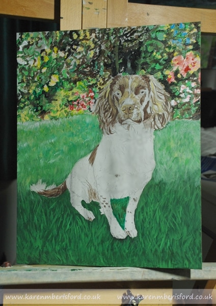 The base layer - Very messy but important | 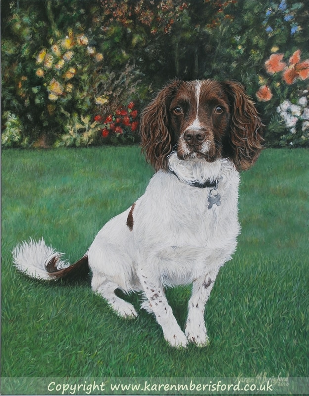 The final completed painting |
"I'm sitting looking at Buddy in pride of place on the wall, photo attached! It is absolutely lovely and it had the desired effect on Steve when he unwrapped - there were tears!! Everyone that has seen it has said how amazing it is with the amount of fine detail and so Buddy. If I manage to get a decent photo of Buddy next to it I will send it on! Thank you once again, it is lovely to have a painting of Buddy forever."
Esther
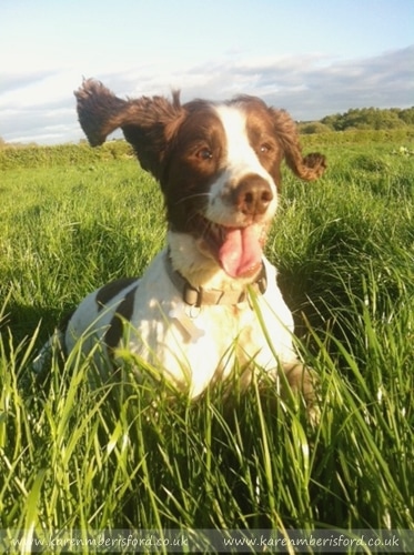 | Dudley the Springer Spaniel - 9" x 12" in AcrylicsThis was a lovely composition but a tiny photo meaning that it pixelated when zooming in and the detail was lost in the face, especially around the eyes. The Commissionee loved the composition so much that I decided to see what I could do and asked if she could send some close up photos of Dudley taken in a less sunny environment and using all the photos together, I elaborated on the background/foreground somewhat and toned down the colouration on his head whilst still keeping the favoured stance. This was a challenge but I really loved the composition too and was happy with the final painting. |
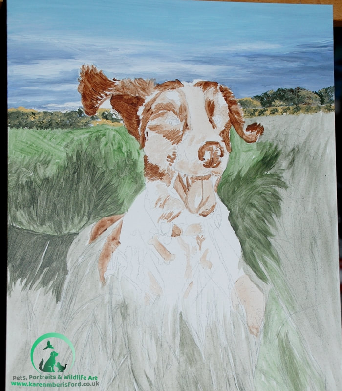 Loose undertones preparing for the layering | 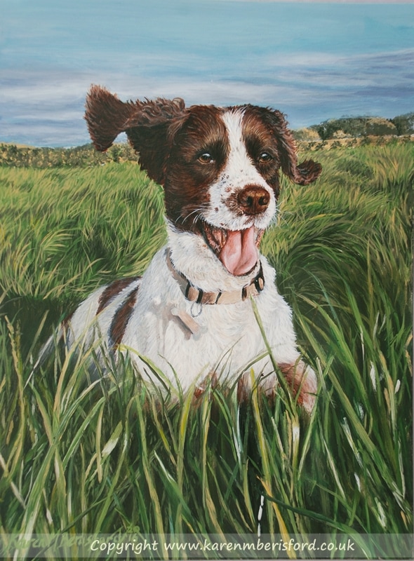 The final painting |
"Just wanted to let you know that mum loves her portrait and we all cried our eyes out when we first saw it. What you've done is so special and we couldn't have asked for a better painting to remember him by. It captures his brilliant personality so well. I'll definitely be recommending you to my spaniel loving friends!
Picture of framed painting to follow soon!
Andrea xx."
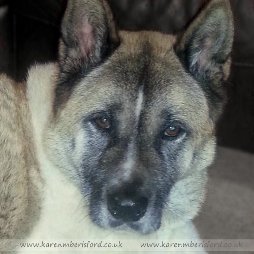 | The customer only had a few photos of Kita, having recently lost her, and I was limited to flash photos. The reference image was a good pose, but as flash distorts colour and detail, I had to research the breed and add a little artistic licence. The image was also slightly out of focus, but I found that I was able to apply a lot of detail by overworking the fur, and the final portrait was far more detailed than I thought possible. The final painting was framed in a black moulding called ASHGATE, which accentuated the light tones in Kita's fur. |
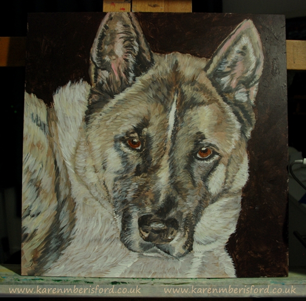 | 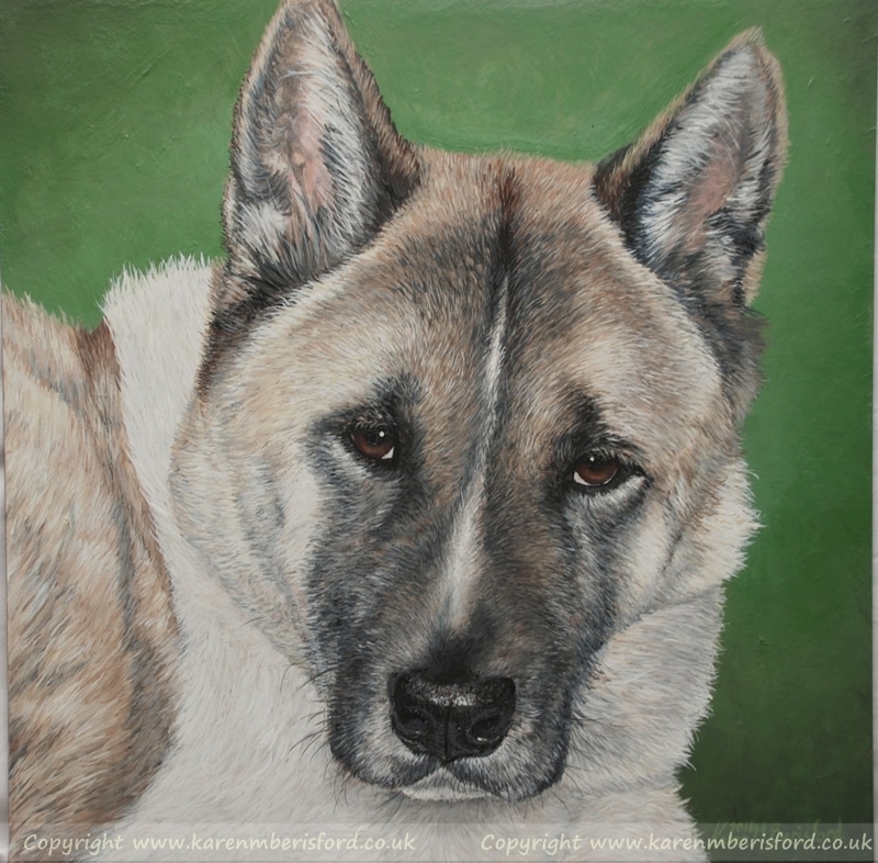 |
"Hi Karen, I just wanted you to know that I absolutely love my painting of Kita. Thank you so much, you have done the most amazing portrait of him. He was my best friend and my little boy and the painting has been hung in the living room so we can all admire him everyday! Thank you again xx"
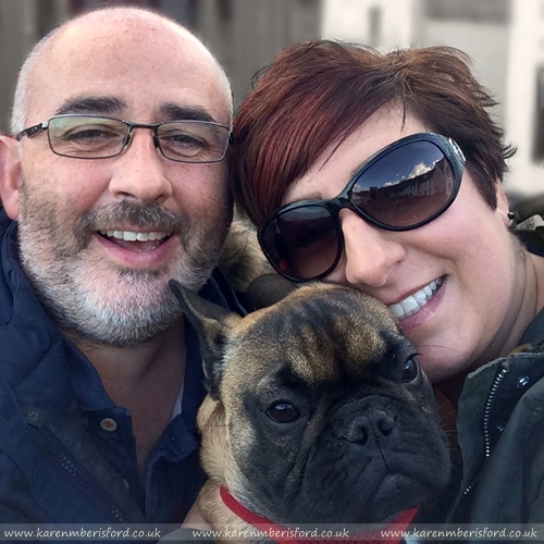 | Diarmid E-mailed me a great photo of himself, his girlfriend Max and their little French Bulldog Kyla stood in front of the famous red phone box from the film 'Local Hero' when they visited Pennan in Aberdeenshire. As the phone box only covered half the background and the other half would add nothing to the composition it was decided to leave the background out completely and simply write 'Pennan' in the corner of the portrait. As mobile phone images tend to 'flatten' detail, the fineness of the Coloured pencils brought back the sharpness of detail and I really enjoyed creating this portrait - I always love a challenge! |
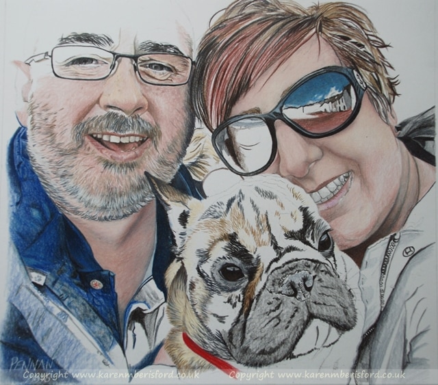 Working on the undertones and building up the tonal layers | 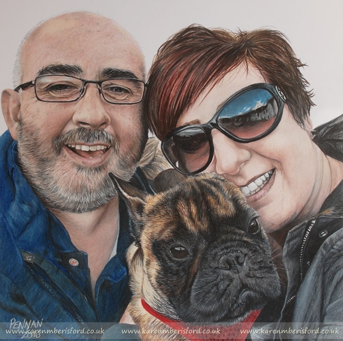 The final portrait treated with an application of UV fixative |
"Hi Karen , Hope you had a lovely Christmas. Wanted to drop you a note to say that Max absolutely loved the portrait! She couldn't believe how well you'd captured the detail from the photo and was thrilled to pieces! We've already recommended you to friends and family and am sure we'll use your amazing skills again in the the future. Have a great New Year!! Diarmid"
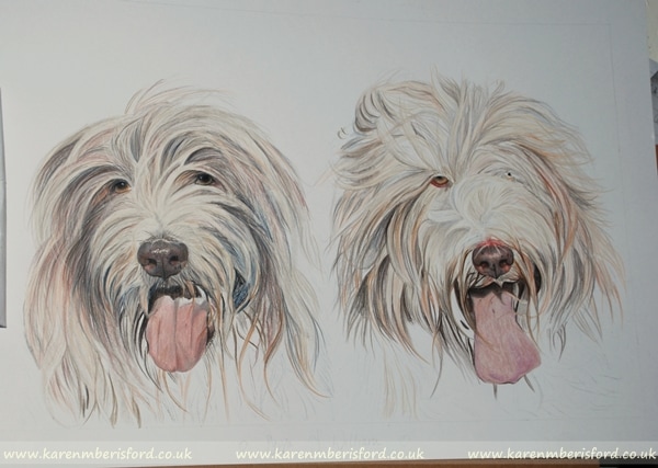
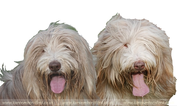 | This portrait was the last drawing I completed for Christmas and depicts 2 Bearded Collie's called Pyppa (L) & William (R) completed in Coloured pencils. I had taken some photos of them both a year earlier but as William (R) is a rather nervous little boy, I struggled to get any close ups of him. trying to distinguish between them after a year was a challenge too! I was provided with a few great quality photos which I could also use to add in their eyes a little more too. |
 | 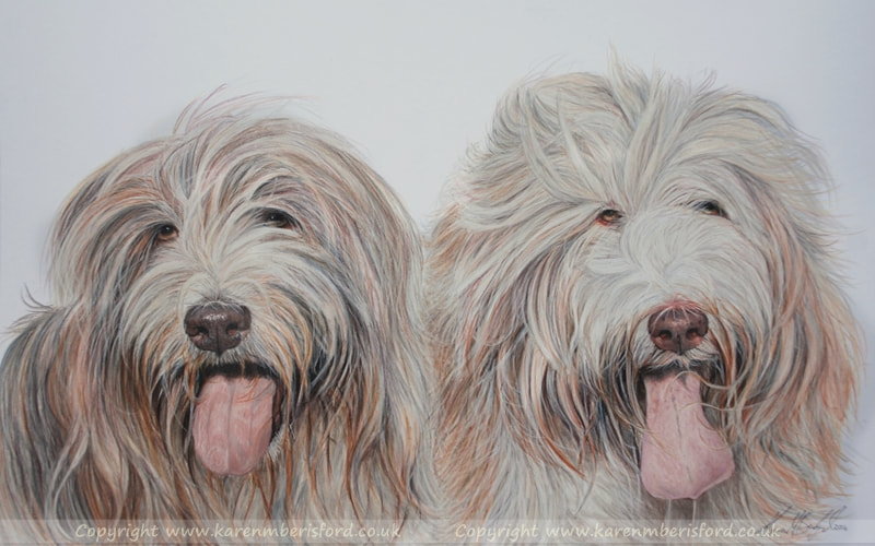 |
"Thank you so much for my beautiful portrait, you've really excelled yourself this time, its amazing!"
Bailey - 10" x 12" Coloured pencil pet portrait
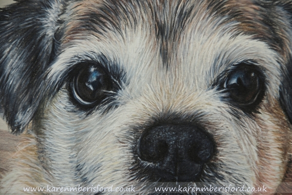 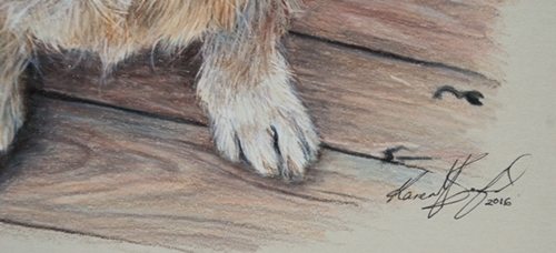 | 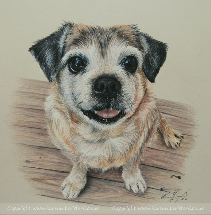 |
The portrait of Bailey has been modified to include the floorboards featured in Casey's portrait, ensuring visual continuity and balance. Originally, Bailey was seated on a green striped rug, but changes can be readily made upon customer request. To view Bailey's portrait and the other pencil drawings created for this client, please click the link below.
" Bailey just arrived! Well, about 15 minutes of tape removal ago. We are so chuffed! Bailey was loved by all of us, but loves my husband best, he was over the moon! We are blessed by your talent!
I just love him! Thank you so much! xxxx"
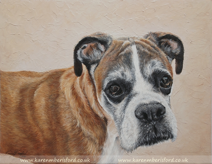
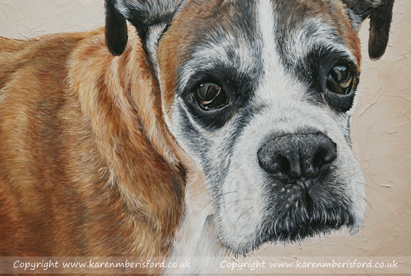
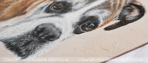
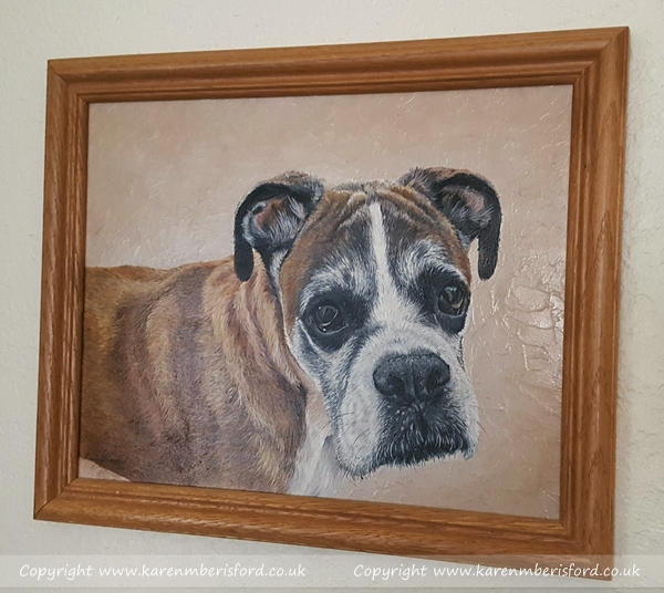
Obe - 11" x 14" Boxer Dog Acrylic painting
 |  |
Help and advice is at hand if so....
- I need to have a range that allows multiple layering
- I need them to blend well for backgrounds and skin tones
- Will work well with fixative
- The pencils must be extremely lightfast and the colours strong
- Need soft and hard pencils for different areas of my work
- Black & White Test
- Hardness V's Softness
- 10 layer test - 'Mixed' layering
- Fixative test
- Blendability
The very popular Prismacolor Premier & Verithin ranges will also be added to this article very soon and an adaptation of this article (with even more information in) will be available to view and purchase (download or hard copy) from the USA's Colored pencil Magazine 'Student' version in the next few months.
Find out more about this magazine here: Colored pencil magazine - Student Edition
Art Tutoring Website Update
 | I began my own art group in 2011 when I lived in Chesterfield and my now defunct domain name for this website, www.chesterfieldartsgroup.co.uk, was created purely as an advertising tool for my art group. Over the last few years, my tutoring side of the business has adapted, and the website also needed to keep up with these changes. The domain name and website was renamed www.stepbystepart.co.uk, in keeping with the way that I tutor my art workshops. I redeveloped my website to provide help and advice to artists from all walks of life whether an amateur or professional. |
Chesterfield Art WorkshopsThere are now a couple of Chesterfield workshops planned for 2015. As always, places are limited, so if you are looking to attend one of my workshops, please get in touch as soon as possible. Click the link to view current workshops available | 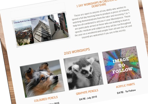 Visit the 1 Day Art Workshops available in Chesterfield |
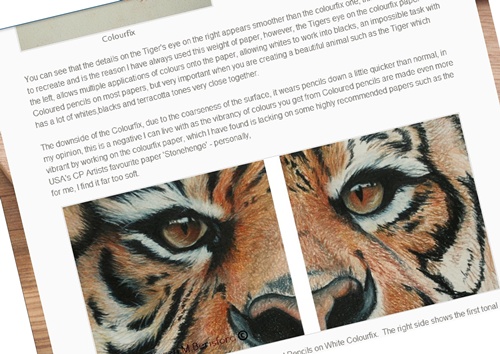 Article on Colourfix paper - Click the image to read | Information available for other ArtistsMy workshop website has now been adapted to provide a hub of information for artists all over the world. There are articles that cover a variety of products and helpful information. I have always enjoyed sharing my own knowledge on a wide range of things from how to produce a pencil portrait to product recommendations that I have personally tried & tested, so I hope to bring on board other artists who can pass on their own knowledge too, which widens the pool into art mediums and products. |
Karen :)
*Paws For Charity is no longer operational.


About the art products I use


I'd love to hear about your own individual insights and approaches to work. In the comments section, please share your own preferred products that contribute to your most successful outcomes.
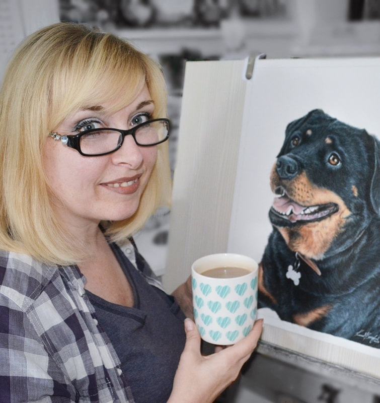
Author
Karen M Berisford


Categories
All
1950's Clothing
1956 Vintage Montclair
1 Day Art Workshops
2 Day Art Workshop
Acrylic Artist
Acrylic Art On Gessobord
Acrylic Art On Pastelbord
Acrylic Glass
Acrylic Paint Article
Acrylic Paints
Acrylic Pet Artist
Acrylic Pet Painter
Acrylic Pet Portraits
Alaskan Husky Drawing
Alaskan Husky In Coloured Pencils
American Kestrel
Ampersand Bords
Ampersand Pastelbord
Art Advice For Beginners
Articles For Artists
Art Spectrum Colourfix
Art Studio
Art Workshops In Chesterfield
Art Workshops In Northumberland
Avocet
Baby Boxer Dog Painting
Bakewell Frame
Barn Owl
Battaleur
Bearded Collie Pet Portrait
Bearded Collies
Bee-eater
Berol Karismacolor
Berol Karismacolor Article
Bespoke Art Commissions
Bespoke Pet Portrait
Big Cat Artwork
Bird Art In Acrylics
Bird Art In Coloured Pencils
Bird Art Workshops
Bird Of Prey Experience
Black Cocker Spaniel
Black Colourfix
Black Labrador
Black Labrador Art
Black Labrador Oil Pastels
Black Labrador Pastels
Black Newfoundland
Black Newfoundland Dog Drawing
Black Rhino Art Workshop
Black Rhino Graphite Pencils Workshop
Black Watch Soldier 1940
Black Watch Soldier In Coloured Pencils
Bockingford HP Watercolour Paper
Boxer Dog Drawings
Boxer Dog Pet Art
Boxer Dog Pet Artist
Boxer Dog Pup
Boxer Dog Puppy
Brindle Boxer Dog
Brown Labrador Art
Bullfinch
Bullfinch Painting
Calico Acrylic Painting
Calico Cat
Caracara
Caran Dache Luminance Pencils
Caran D'Ache Neopastel
Caran Dache Neopastel
Car Art
Cat Artist
Cat Paintings
Cat Paintings In Acrylic
Chesterfield Art Workshops
Chesterfield Pet Artist
Chocolate Labrador
Chocolate Labrador In Coloured Pencils
Chocolate-labrador-pet-portrait
Chow Chow
Chow Chow Painting
Christmas 2018
Christmas For The Dogs
Clairfontaine Pastelmat
Cocker Spaniel In Acrylics
Cocker Spaniel Pencil Portrait
Colored Pencil Art
Colored Pencil Magazine
Colored Pencils
Coloured Paper Article
Coloured Pencil Art
Coloured Pencil Article
Coloured Pencil Artist
Coloured Pencil Commissions
Coloured Pencil Hints And Tips
Coloured Pencils
Coloured Pencils Artwork
Coloured-pencils-workshops
Coloured Pencil Workshop
Colourfix
Common Sandpiper
Cresswell Pond
Curlews
Derbyshire Pet Artist
Derwent Chromaflow
Derwent Coloured Pencils
Derwent Coloursoft
Derwent Coloursoft Pencils
Derwent Coloursoft Pencils Article
Derwent Graphic Pencils
Derwent Graphitint
Derwent Inktense Pencils
Derwent Lightfast
Derwent Pencils
Derwent Procolour Pencils
Detailed Art
Detailed Art Commissions
Discontinued Coloured Pencils
Dog Art
Dog Artist
Dog Artistry
Dog Drawing Commissions
Dog Drawings
Dog Paintings
Dog Portraits In Acrylics
Dog Portraits In Coloured Pencils
Domestic Cat In Acrylics
Double Collared Sunbird
Druridge Pools
Eider Duck
Faber Castell PITT Pastel Pencils
Fawn Boxer Dog
Fine Art
Fisher400
Frames For Acrylic Paintings
Framing Service Bespoke Portraits
Framing Service - Bespoke Portraits
Free Art Tutorials
French Bulldog In Coloured Pencils
Fulmar
Galeria Acrylic Paint Article
Galeria Black Lava Texture Gel
Gessobord
Glass With Spacer
GOLDEN Acrylics
Golden Eagle
GOLDEN Heavy Body Acrylics
Graphite Art Workshop In Derbyshire
Graphite Pencil Article
Graphite Pencil Art Workshops
Graphite Pencils
Graphite Pencil Workshop UK
Graphite Portrait
Grapite Pencil Tutorial
Green Car
Green Car Interior
Green Shoes
Grey Heron
Grey Pastelbord
Gyr Falcon
Hadrian's Wall
Harris Hawk
Human Portrait Art
Human Portrait Drawing
Jack Russell In Coloured Pencils
Jack Russell Pet Portrait
Japanese Akita
Japanese Akita Acrylic Painting
Karen M Berisford Art Workshops
Karen M Berisford Framing Service
Karismacolor Pencils
Karisma Pencils
Kestrel
Kingfisher
Kingfisher Painting
Labrador Art
Labrador Drawing
Labrador In Coloured Pencils
Labrador Oil Pastel
Labrador Pet Art
Labrador Pet Portrait
Labrador Photography
Labrador Retriever
Labrador Retrievers
Lapwing
Legion Stonehenge Paper
Lemur In Graphite Art Workshop
Lifelike Boxer Dog Portrait
Lifelike Drawings
Linnet
Little Egret
Little Owl
Mackerel Tabby Cat
Mackerel Tabby In Coloured Pencils
Mercury Montclair
Mercury Montclair 2 Door
Mercury Montclair 2-door
Mercury Montclair Hardtop
Mint Green Shoes
Mixed-breed Dog
Montclair Artwork
Montclair Two Tone
Moorhen
Moving To Newbiggin By The Sea
Neopastel
Newbiggin Bird Rarities
Newbiggin Birds
Newbiggin By The Sea
Newbiggin By The Sea Artist
Newbiggin-coloured-pencil
Newfoundland Dog
Newfoundland Pet Portrait
Nikon D80
Northern Inuit Art Workshop
Northumberland
Northumberland Art
Northumberland Artist
Northumberland Birds
Northumberland Landscape
Northumberland Pet Artist
Northumberland Photography
Northumberland Wildlife
Oil Pastel Drawers
Oil Pastel Painting
Oil Pastel Pet Art
Oil Pastels
Oil Pastels Article
Ornate Black Frame
Oystercatcher
Padley Gorge
Padley Gorge In Autumn
Pastelbord
Pastelmat Paper
Pastel Portrait
Peak District
Pencil Portraits
Pencil Storage Drawers
Pet Art Commissions
Pet Art In Pencils
Pet Artist
Pet Drawing
Pet Painting
Pet Paintings
Pet Portrait Artist
Pet Portraits In Pencil
Pheasant
Photography
Pied Wagtail
Polychromos Pencils
Poppy Fields
Poppy Fields Soft Pastels
Portrait Artist
Presents For Dogs
Prismacolor NuPastels
Prismacolor Pencils
Prismacolor Premier
Rare Colored Pencils
Rare Coloured Pencils
Rare Pencils
Realistic Art
Realistic Pet Paintings
Red Fox Labrador
Red Fox Labrador Drawing
Red Squirrel Painting
Reed Bunting
Reed Warbler
Ringed Plover
Ring Tailed Lemur Art Workshop
Ring Tailed Lemur In Graphite Pencils
Robin Hood Tree
Saltergate Silver Frame
Sandwich Terns
Scotch Macaskill
Sennelier Oil Pastels
Sharpening Pencils Article
Shorthair Cat
Shorthaired Cat Acrylic Painting
Shorthaired Cat In Acrylics
Skies Tutorial With Soft Pastels
Snow Leopard
Snow Leopard Art Workshop
Snow Leopard Eye Tutorial
Snow Leopard Pencil Drawing
Soft Pastels
Soft Pastels Tutorial
South African Bird Art
Springer Spaniel
Springer Spaniel Art
Springer Spaniel In Acrylics
Springer Spaniel Painting
Starling
Starting Out With Coloured Pencils
Starting Out With Oil Paints
Step By Step Art
Step By Step Art Tutorial
Step By Step Art Tutorials
Stonechat
Sumatran Tiger Art Workshop
Sunbird Painting
Swallow
Sycamore Gap Hadrian's Wall
Sycamore Gap Northumberland
Sycamore Gap Tree
Sycamore Tree
Tonal Layering With Coloured Pencils
Tree Sparrow
Tufted Ducks
Uk Art Workshops
UKCPS
Unison Pastels Article
Ursus Paper Article
Vegan Art Products
Vintage Art Supplies
Vintage Colored Pencils
Vintage Coloured Pencils
Wheatear
Whinchat
White Boxer Dog
White Boxer Pup
Whitethroat
Whitethroat On Gorse
WHsmith Coloured Pencils
Wildlife Art Workshops
Wild Rabbits
Willow Warbler
Wynyard Hall
Wynyard Hall In Graphite Pencils
Yellowhammer
Yellow Labrador
Yellow Labrador Art
Zest-it Pencil Blend
Archives
July 2024
March 2024
January 2024
December 2023
August 2023
July 2023
April 2023
February 2023
August 2022
May 2022
March 2022
May 2020
April 2020
October 2019
September 2019
December 2018
March 2018
January 2018
April 2017
December 2016
September 2016
August 2016
June 2016
April 2016
March 2016
February 2016
July 2015
May 2015
April 2015
March 2015
October 2014
August 2014
June 2014
April 2014
December 2012
November 2012
October 2012
September 2012
August 2012
